Kaya Express
A modern, scalable brand identity for a professional decluttering and organization company, built to communicate clarity, ease, and visible transformation.
01 Brief
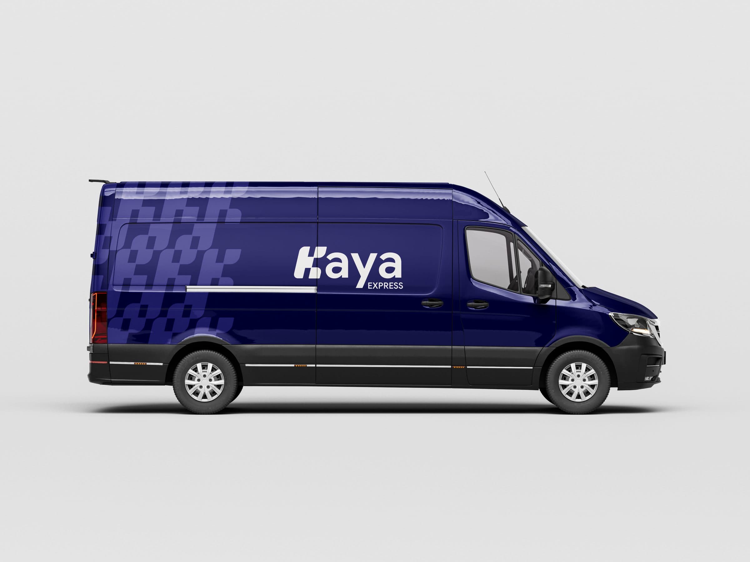
Kaya Express helps individuals and businesses transform chaotic spaces into calm, efficient environments. They needed a brand that could carry that same sense of order and discretion across every touchpoint, from a business card to the side of a Sprinter van.
Identity


02 Challenge
The brand lacked a strong visual identity that communicated its core values of order, efficiency, and calmness. Without consistency, every touchpoint risked feeling improvised, undermining trust in a category that lives or dies on credibility.
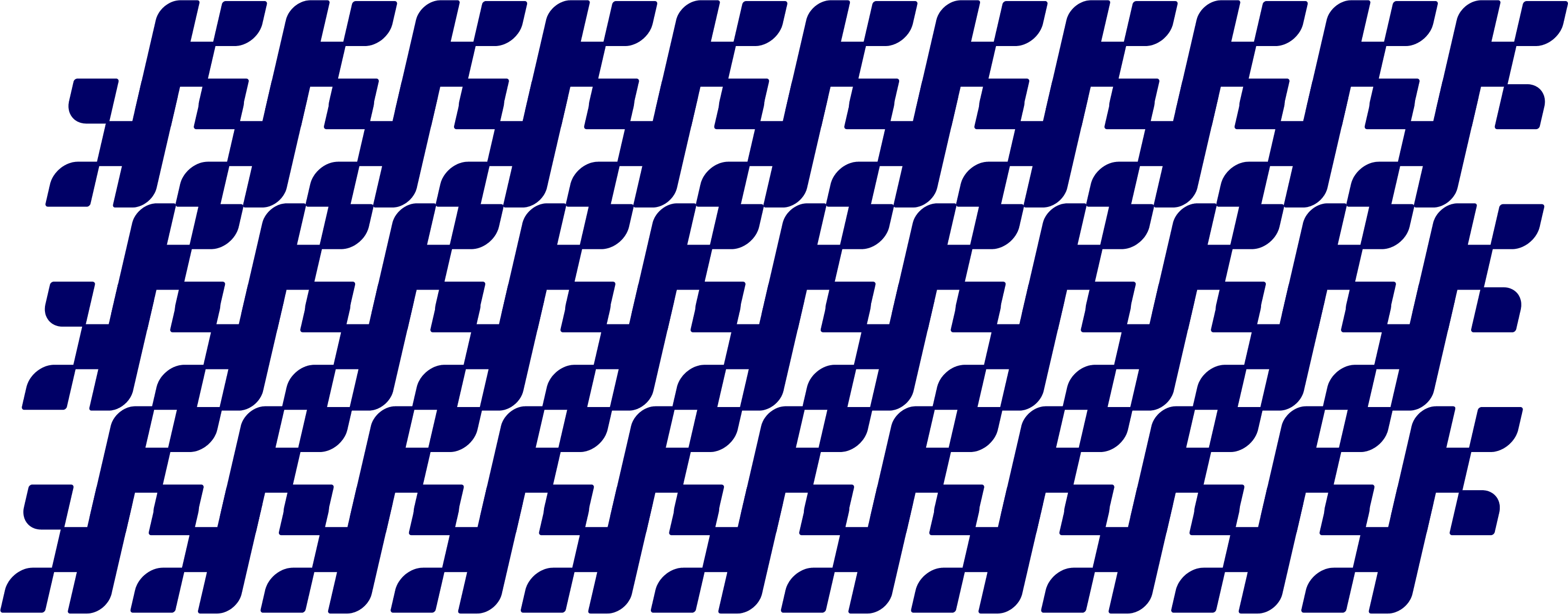
Pattern
03 Approach
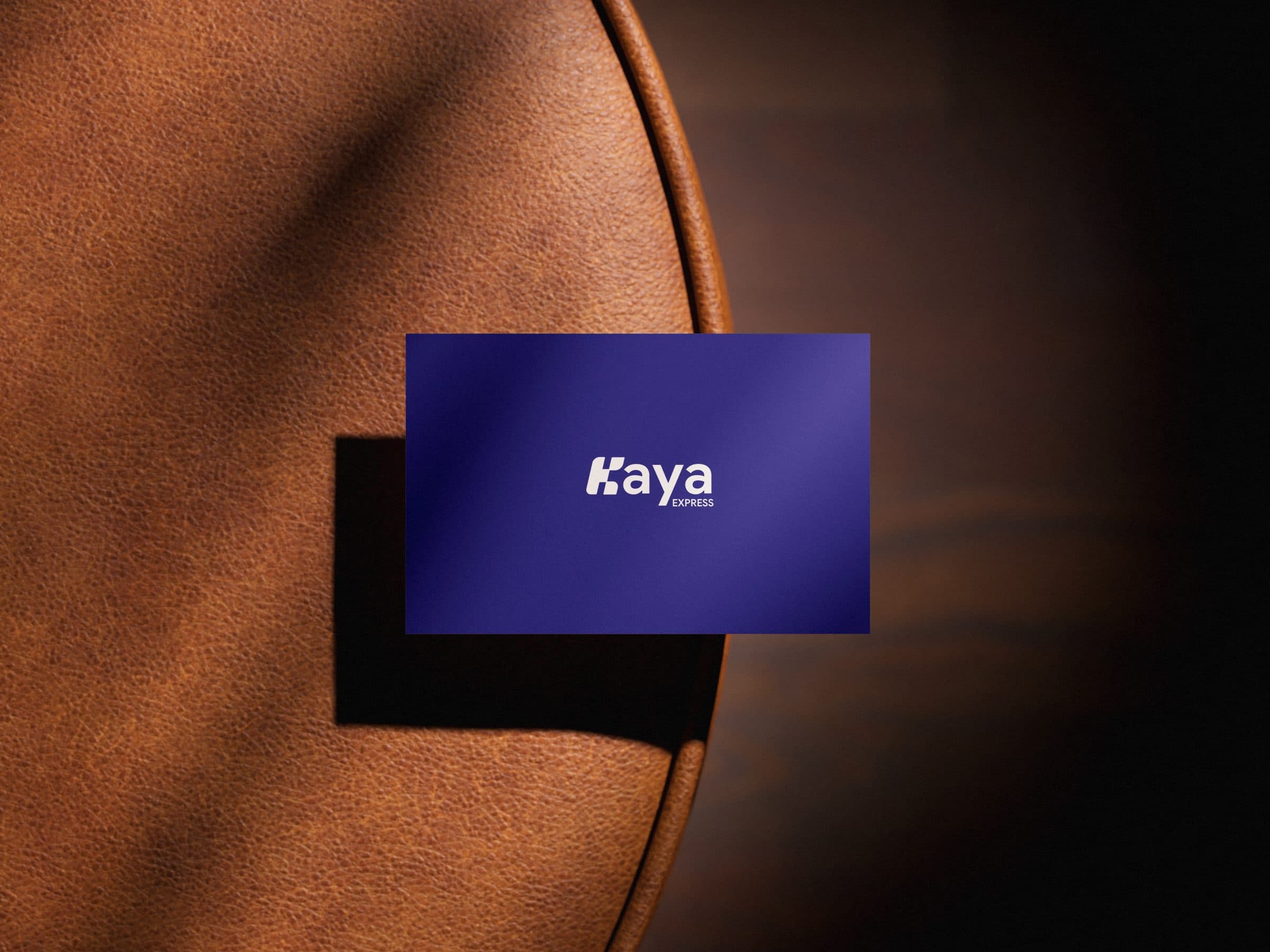
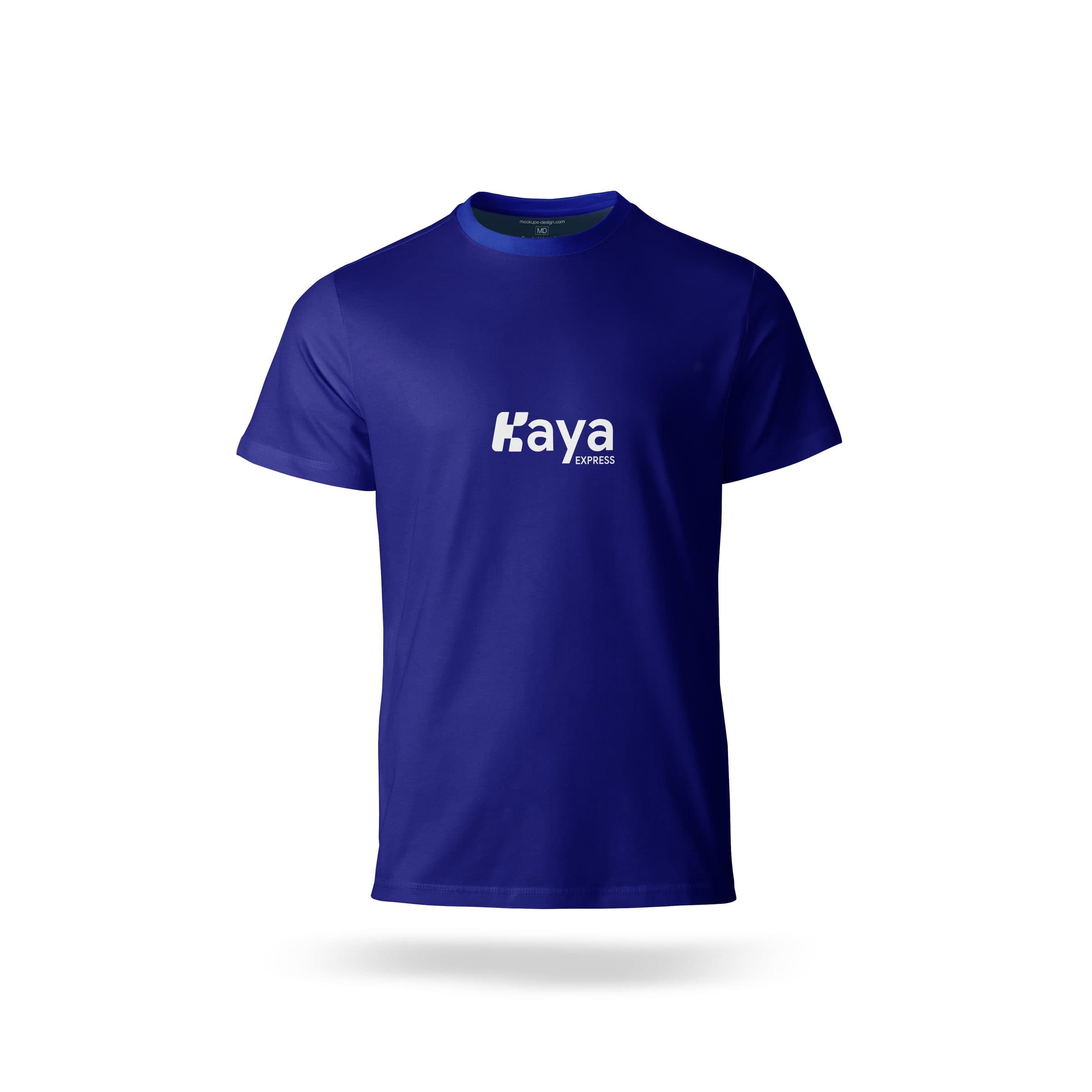
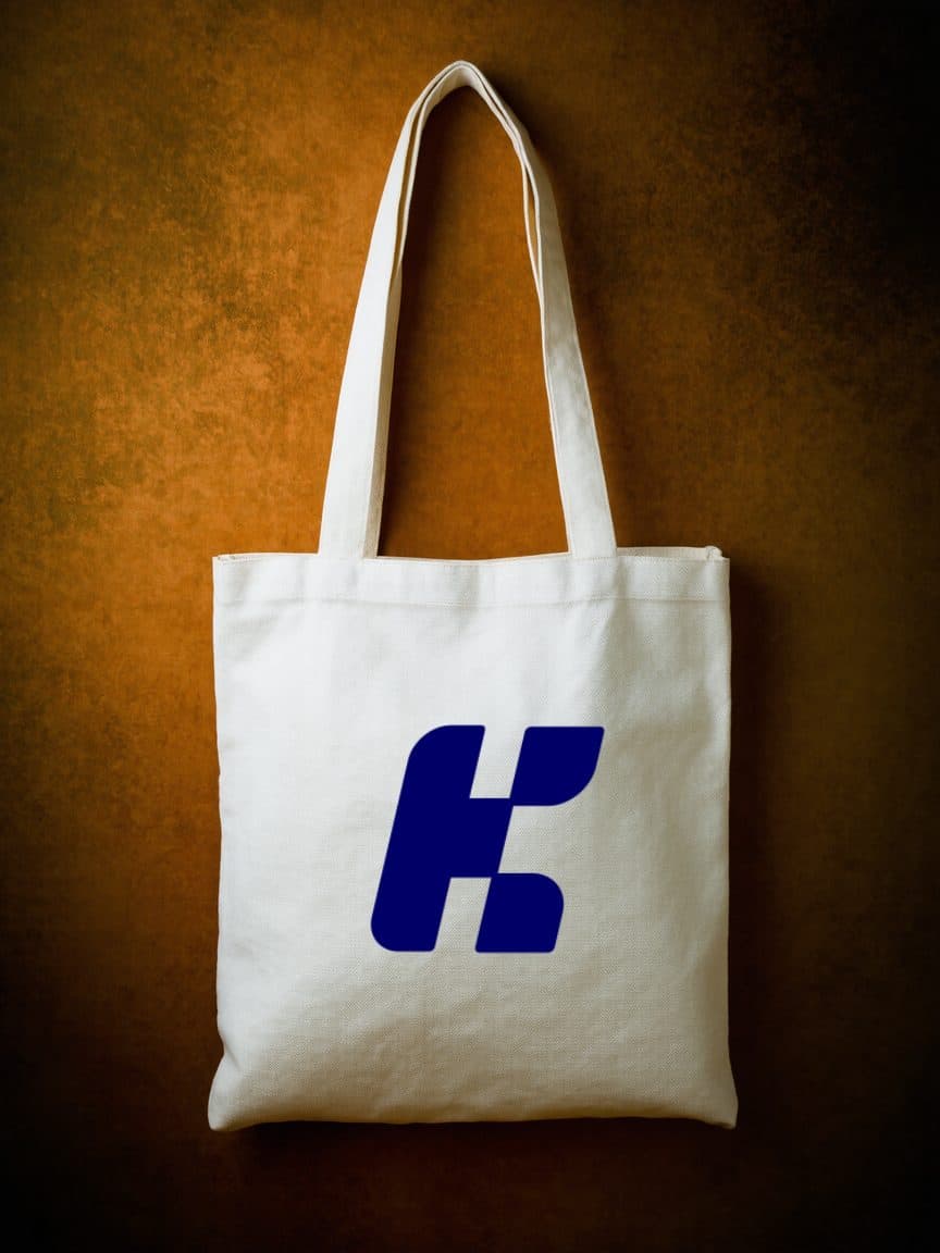
A clean, geometric identity system anchored on a custom 'K' symbol derived from the brand name. The mark is built on precise curves and structured negative space, visually arguing for transformation from chaos to clarity. A repeating K-motif pattern, midnight-blue palette, and Google Sans / Avenir typography stack tie the system together.
Stationery
Apparel
Outcome
Kaya Express is now positioned as a modern, structured, and professional brand. Recognition is sharper, trust is stronger, and the identity is built to scale across every future touchpoint without losing coherence.