Kaysteph Group
A premium identity transformation for a real estate and property development company built for trust at scale.
01 Brief
Kaysteph Group came to us with strong delivery but an identity that didn't reflect their ambition. Their work spoke premium. Their brand did not yet match it.
In use
02 Challenge
Real estate is a category where credibility is everything and visual cliché is everywhere. The brief was to build a system that signalled trust, modernity, and ambition without leaning on the tired conventions of the industry.
Identity



03 Approach
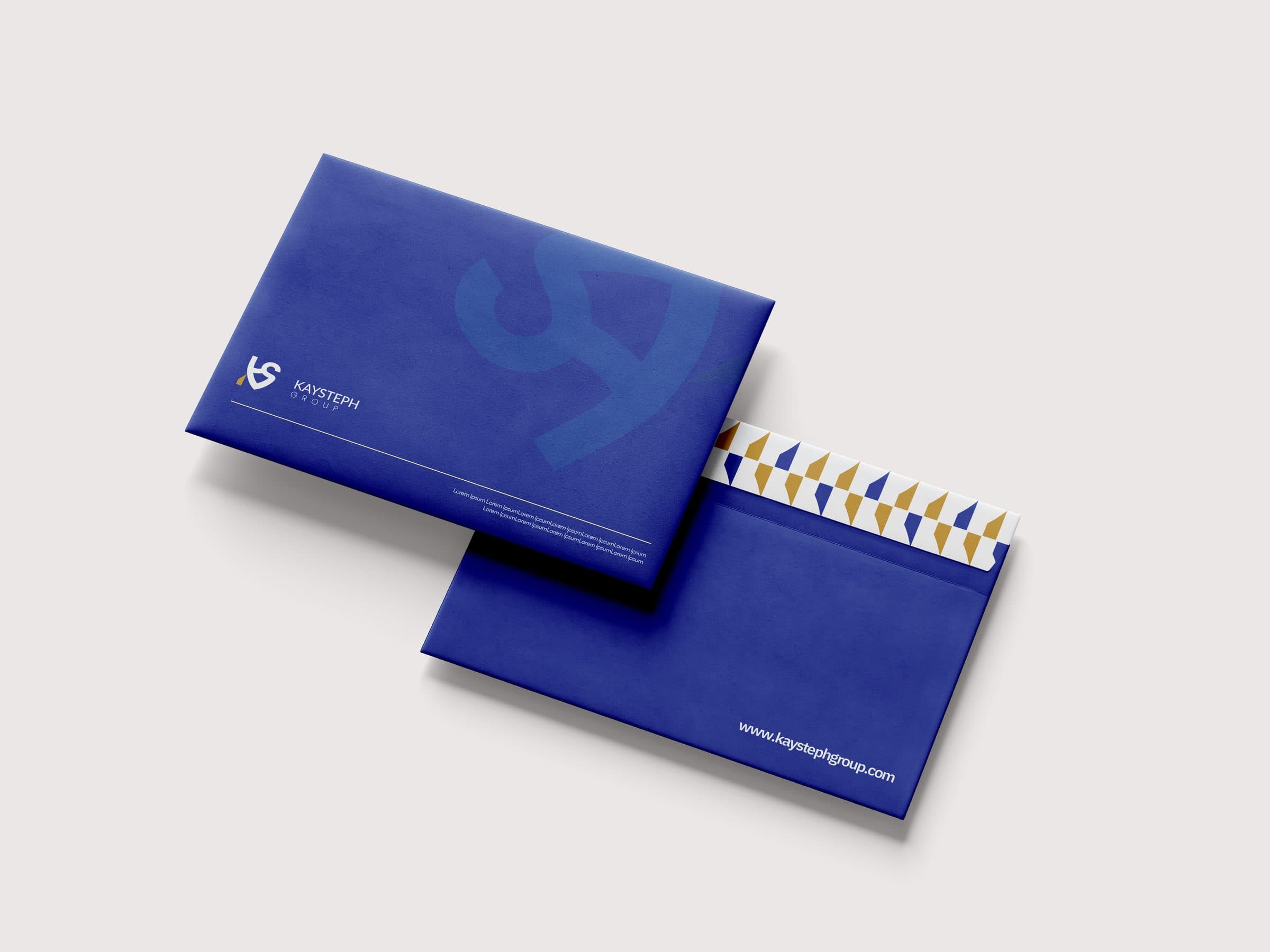
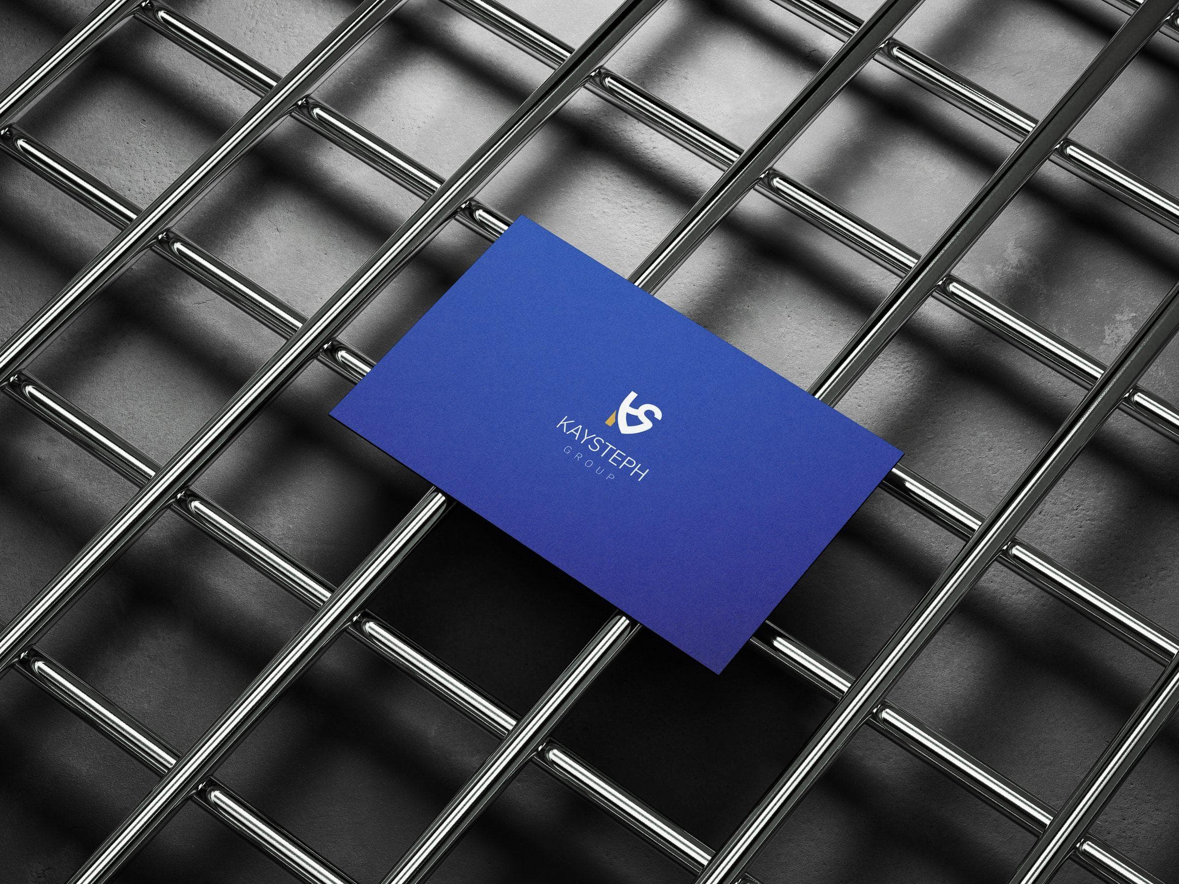
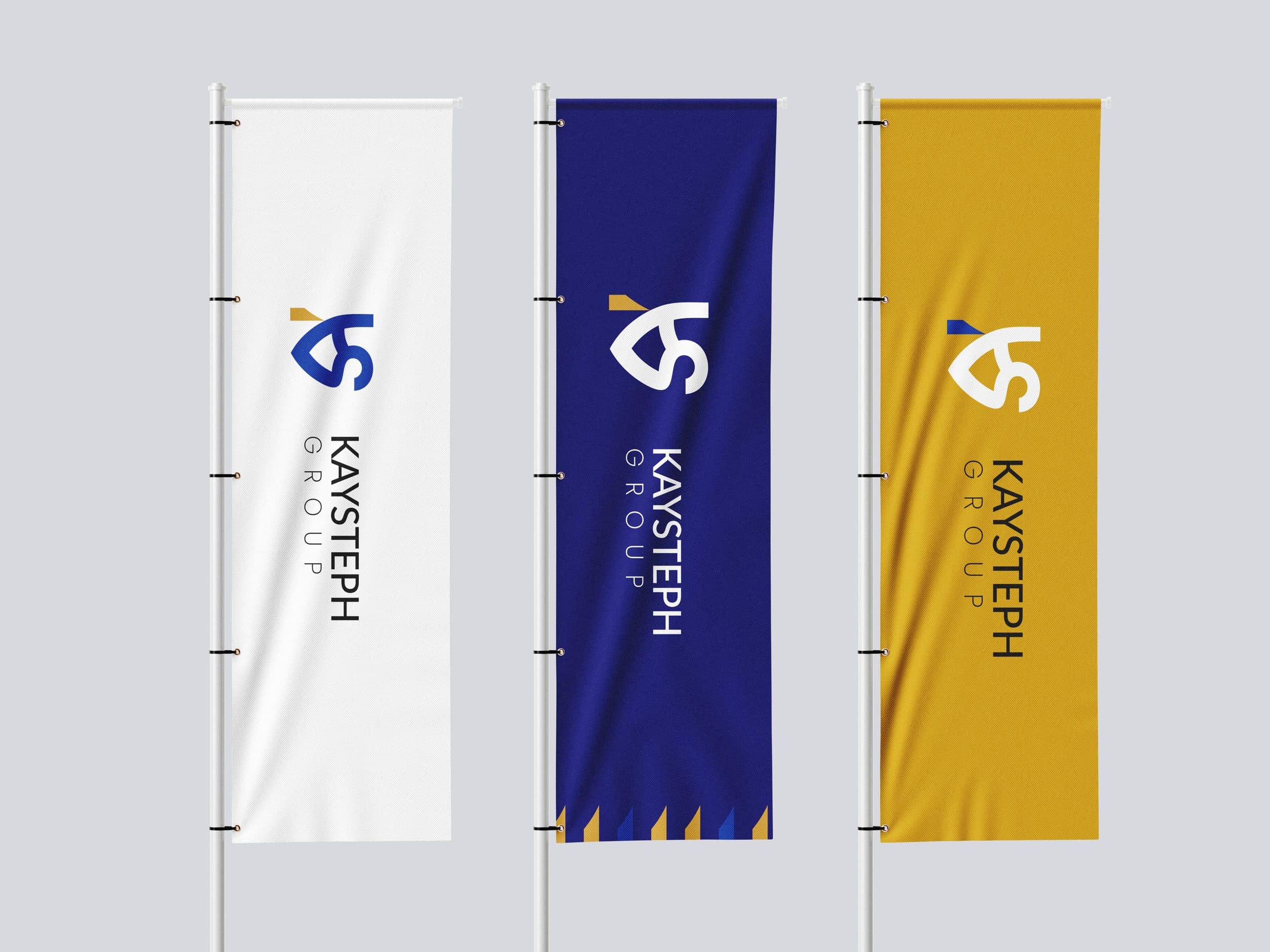
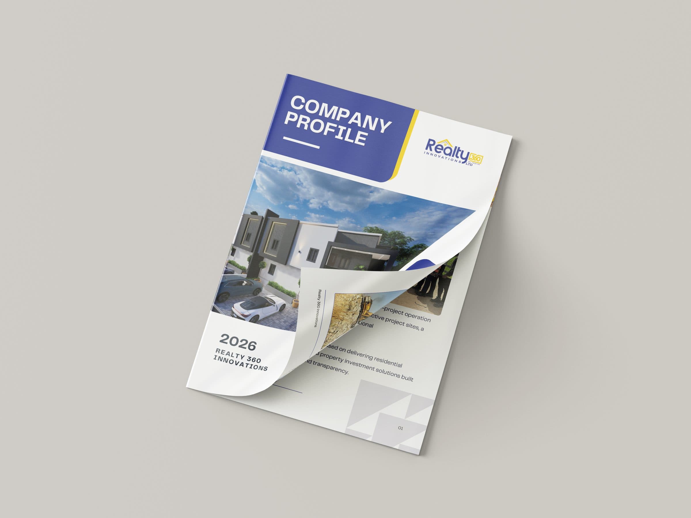
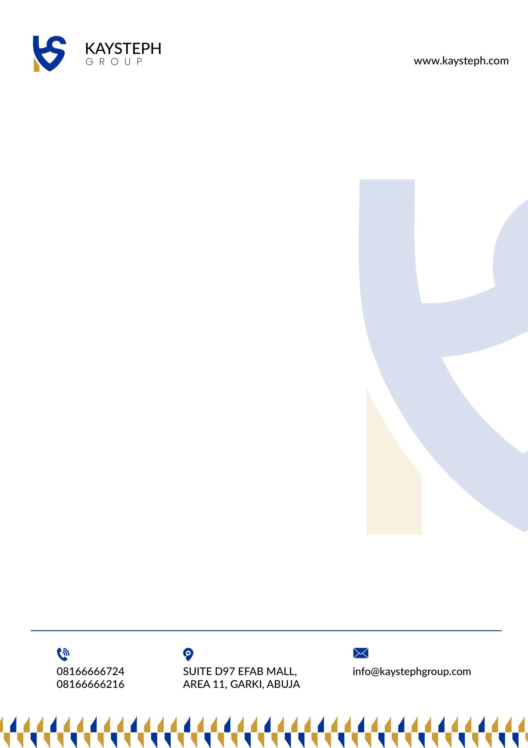
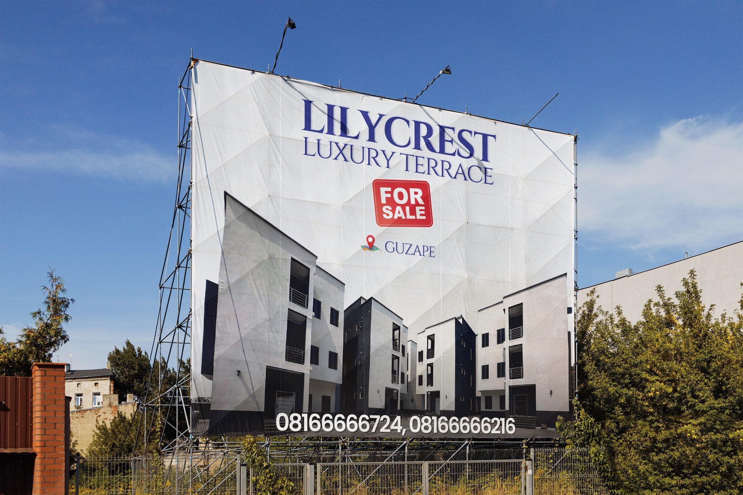
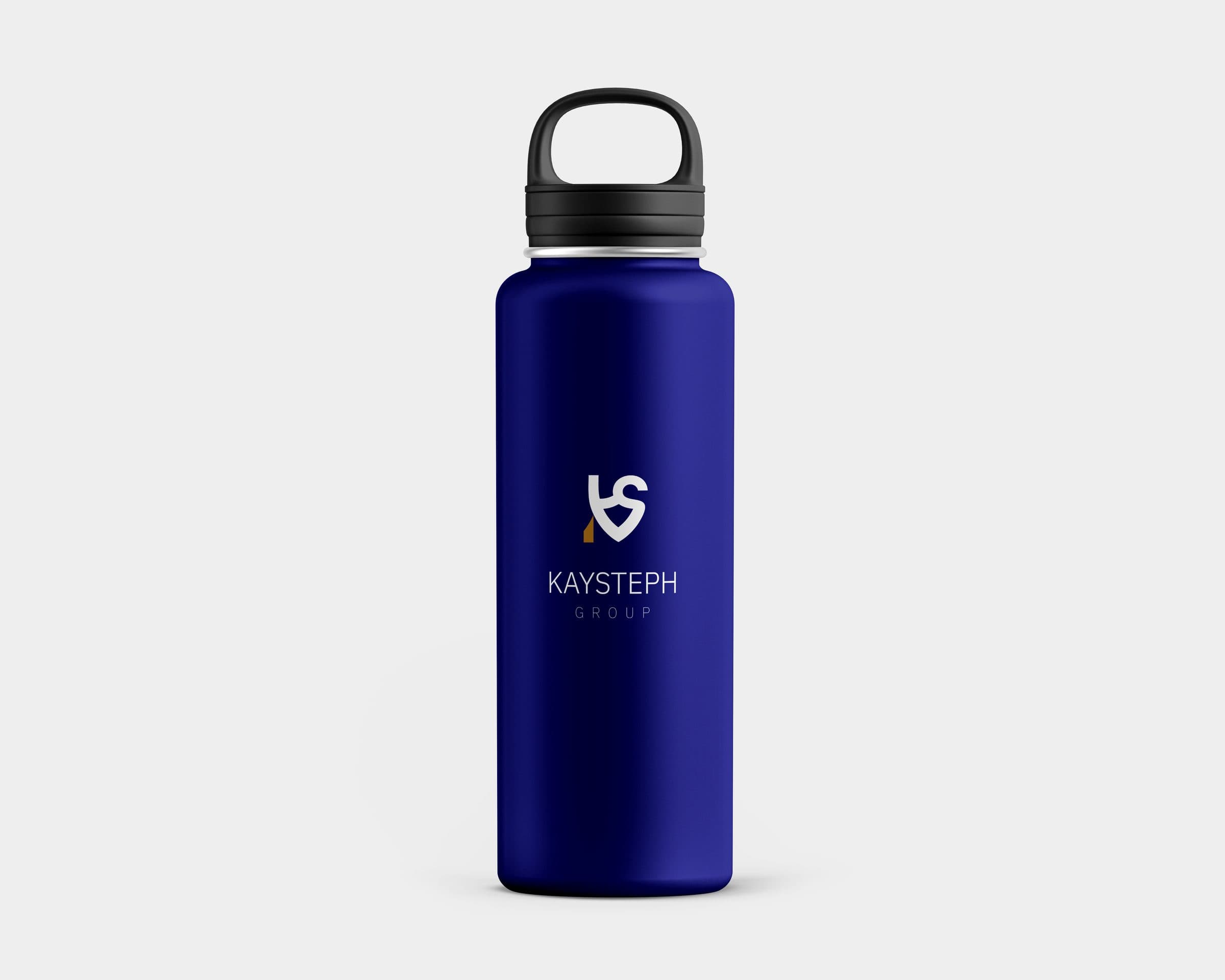
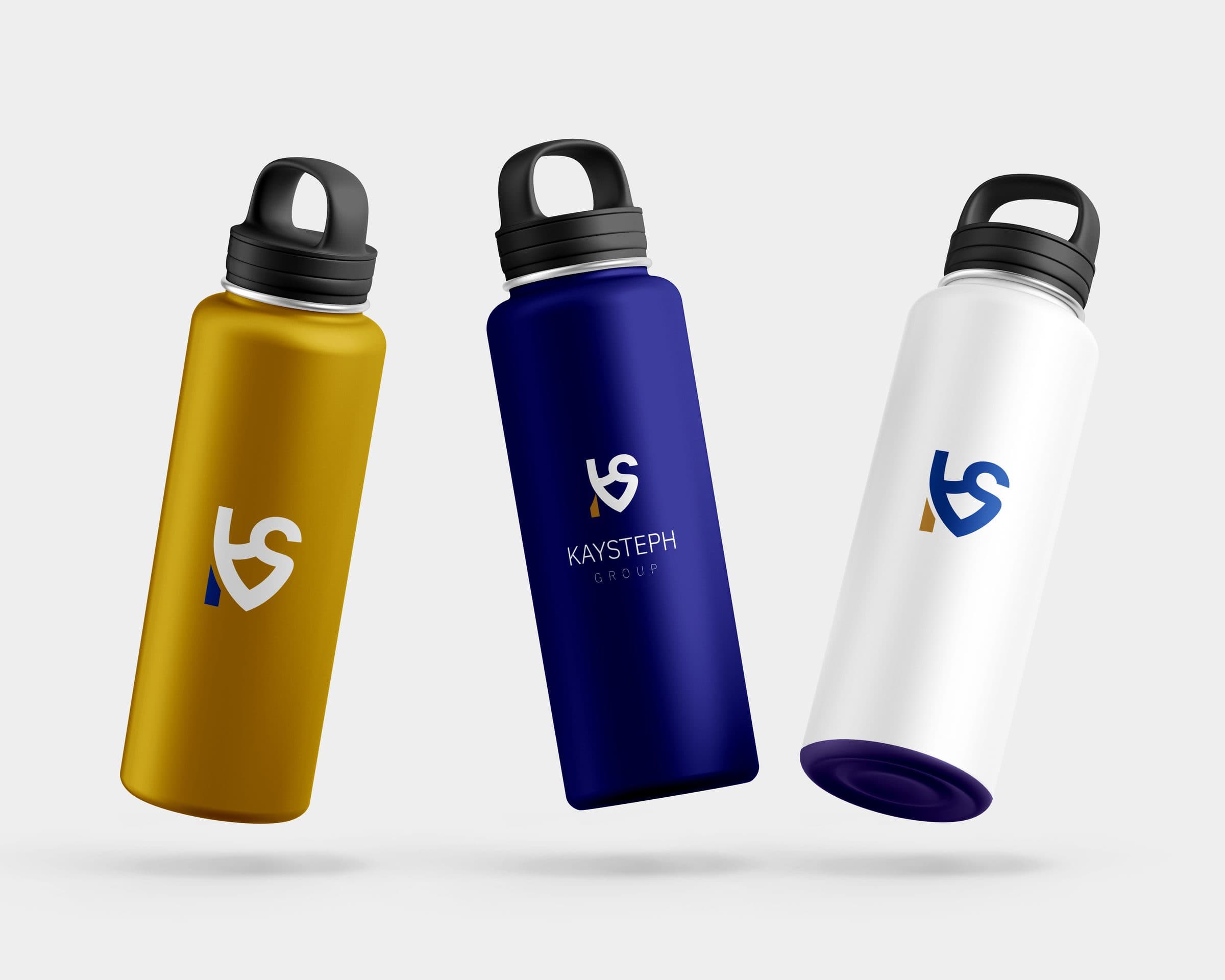
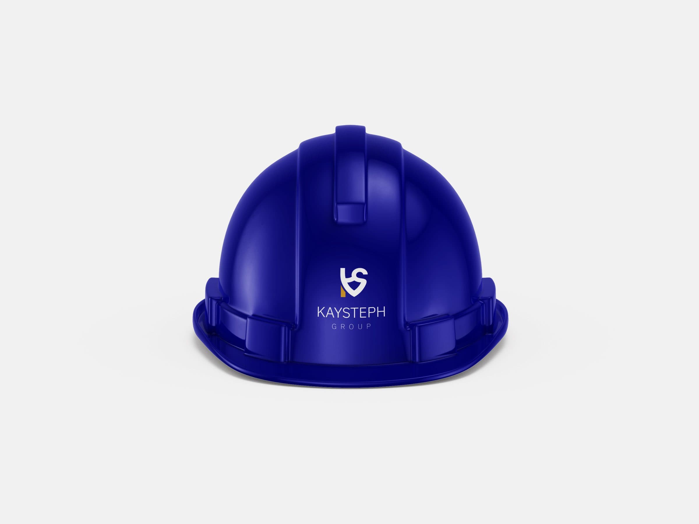
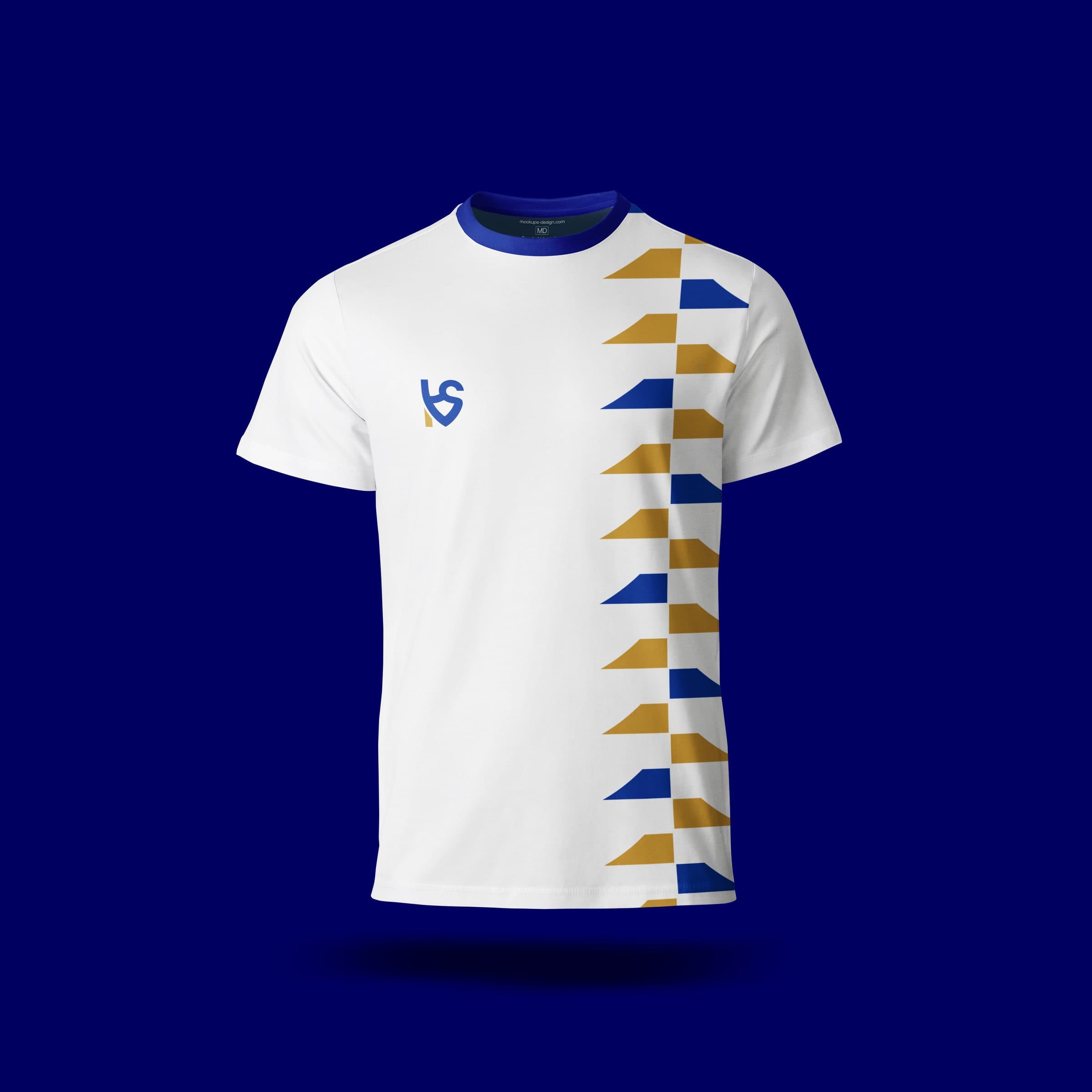
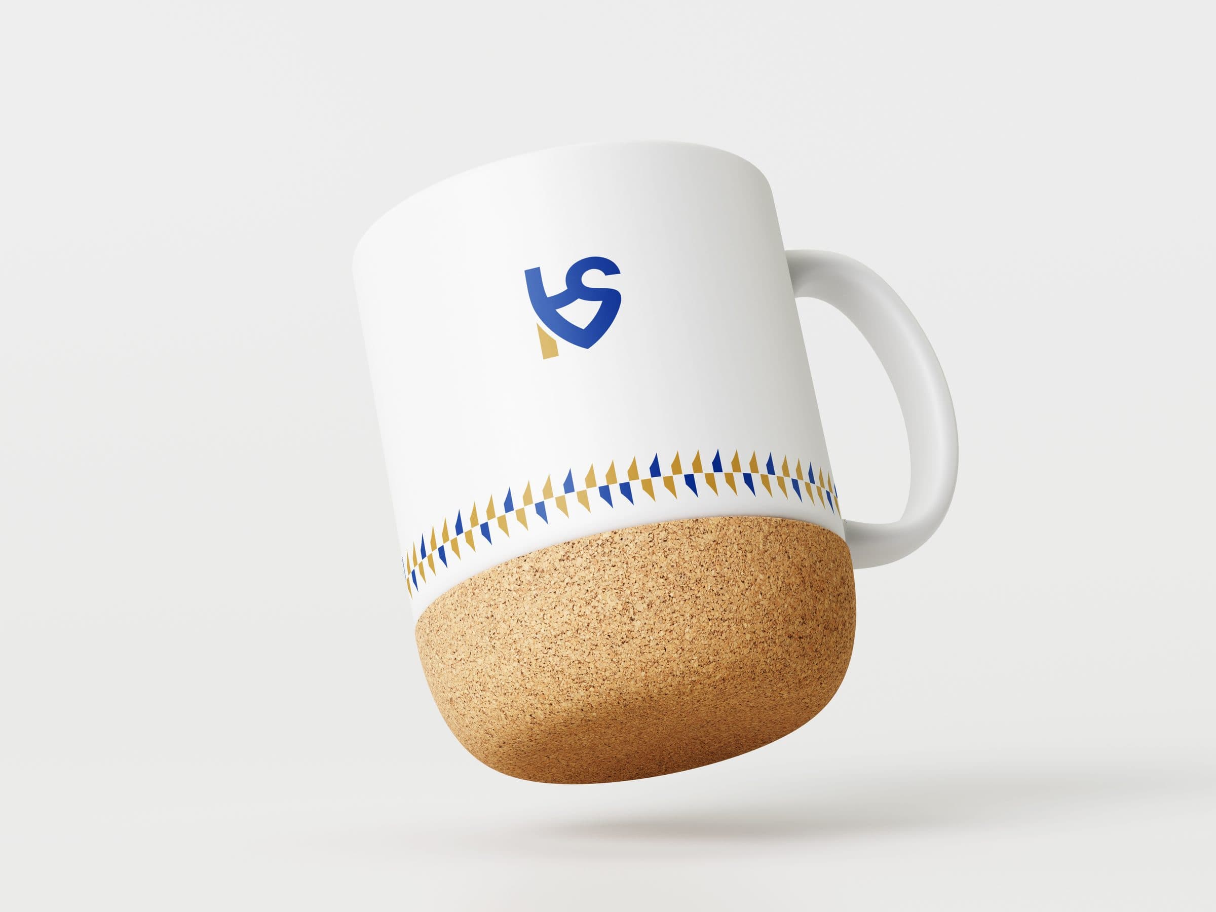
A bold abstract mark anchored in a blue-and-gold palette: blue for trust and stability, gold for craft and value. A full system covers stationery, company profiles, billboards, signage, and merchandise, all governed by a tight typographic and grid foundation that scales from a business card to a 30-foot hoarding.
Pattern

Collateral
In place
Merchandise
Outcome
The rebrand elevated Kaysteph Group into a premium, credible brand with stronger recognition, consistency, and market positioning ready to support the next phase of growth.